

by Seanzor
Hey there, fellow hobbyists! So you’ve kitbashed, converted and painted away at your masterpiece. Now you’re seething for some positive reinforcement so you take a pic of your miniature and ugh, it looks like trash. So you fiddle around with your lights for a bit and wow, it still doesn’t look right. Why doesn’t every picture of a model look exactly like the model? Well there’s a long answer to it, but there’s a reason that photography is an art form of its own.
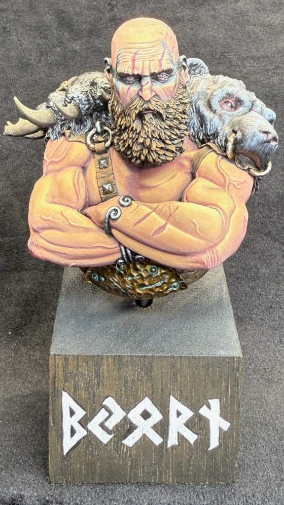
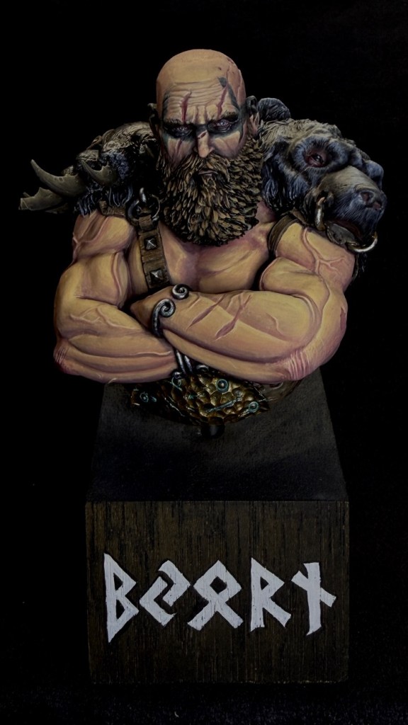
Which one of these do you think looks the best?
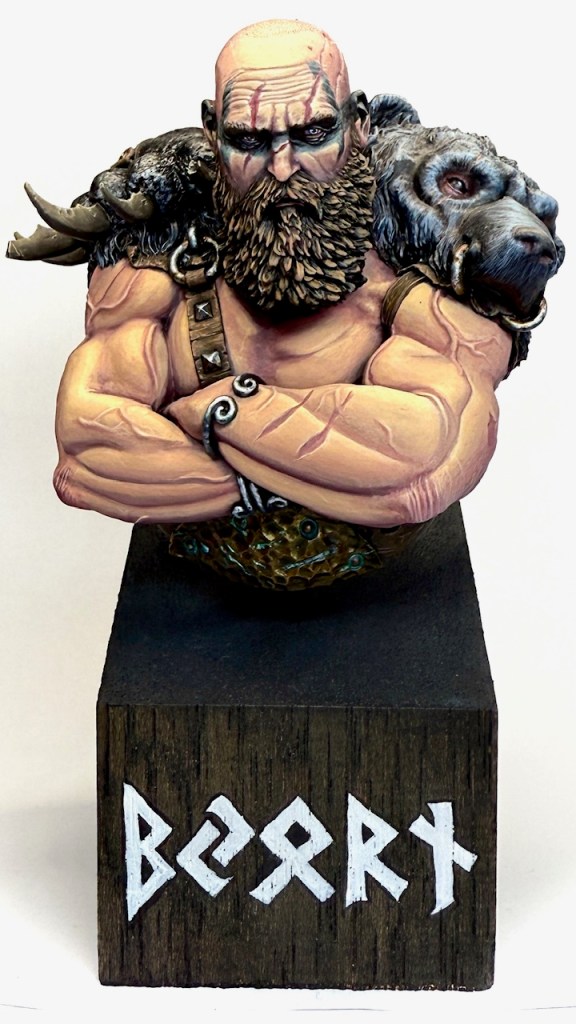
Which do you think represents the real life model the best?


Setting Up
Let’s start at the start. Before we begin you’ll need at least 4 things:
- Backdrop. This can be as simple as a piece of paper, a piece of fabric, or purpose-built photography backdrop
- Model(s). Your newly-painted masterpiece (hopefully the paint is dry!)
- Light(s). You can take good pictures with one light. I prefer to do most things (including painting) with two lights, but you could have 3, 4, 5 or more lights if you want to go deep on this.
- Camera. I think it’s reasonable to assume that most of us want to take pictures with a smart phone, but there’s also an incredible depth to different cameras / lenses / and more that you can delve into if you want to go deeper.
A Note on Backdrops
Backdrops can make a big difference to the “mood” of the picture. If you look at the pictures at the beginning of the article, you’ll notice the same model on a white backdrop vs a black backdrop makes a big difference in how the colours appear.
Generally white backdrops will show more vibrancy of the model but also have a tendency to highlight mistakes as well. Black backdrops will tend to give you a more moody and less difference between the backdrop and the model. You can also use the backdrop to help balance the colour of the picture, as the closer you make your backdrop go to pure white or pure black will also assist later in the picture taking and editing process.
Setting Up Backdrops and Lighting
Let’s look at an example of how I would set up a simple picture-taking area at the front of my painting desk. I’ve used one piece of paper over the top of my palette (as it’s covered in stickers and we want to block out that messy backdrop) and another that is propped up against some paint bottles and the desk, so it makes a sweeping 90 degree angle. You don’t want this backdrop folded or creased as the fold line will show up in the pictures.
Then in this example I’ve got three lights:
- One positioned directly over the top of the model
- One at about a 3/4 angle facing the model
- And one coming in from underneath, pointing directly at the face to reduce shadowing that may occur from the other two
The goal is to use your lights to reduce shadows on the model as much as possible. You’d rather cast the shadow to the backdrop than to get shadows on the model. Unless you want to hide some mistakes, in which case cast those shadows! Another thing to remember is that you want direct lighting on a white backdrop, whereas on a black backdrop the less lighting that hits that backdrop directly, the better an outcome you’ll get.


Taking the Pictures
This process is really just creative problem solving, assessing the outcome and then modifying the inputs until you get a picture that portrays what you’d like.
One of the first tools to become very comfortable with is the Exposure Control on your phone (Apple: https://support.apple.com/en-au/guide/iphone/iph3dc593597/ios). Apple and Samsung both have a very similar controller: you tap on the screen where the subject (the model) is and you get a little box and a scale as show below.
When you scroll your finger up and down it controls how much light is let in by the picture:
Up = more exposure, brighter, more vibrant, towards white
Down = less exposure, darker, more moody, towards black
Until you get comfortable with it, just try different light amounts, take the picture and see what you get. Eventually you’ll get an outcome you enjoy (hopefully). But maybe it’s still not perfect…
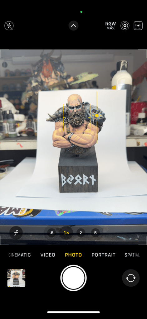
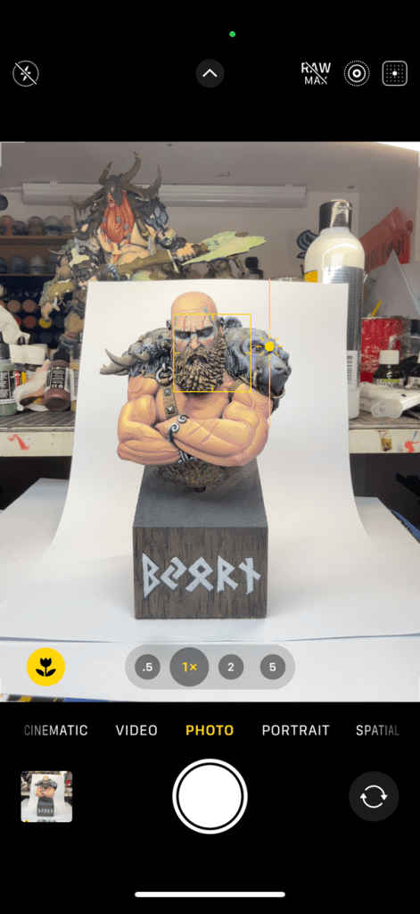

Photo App Modification
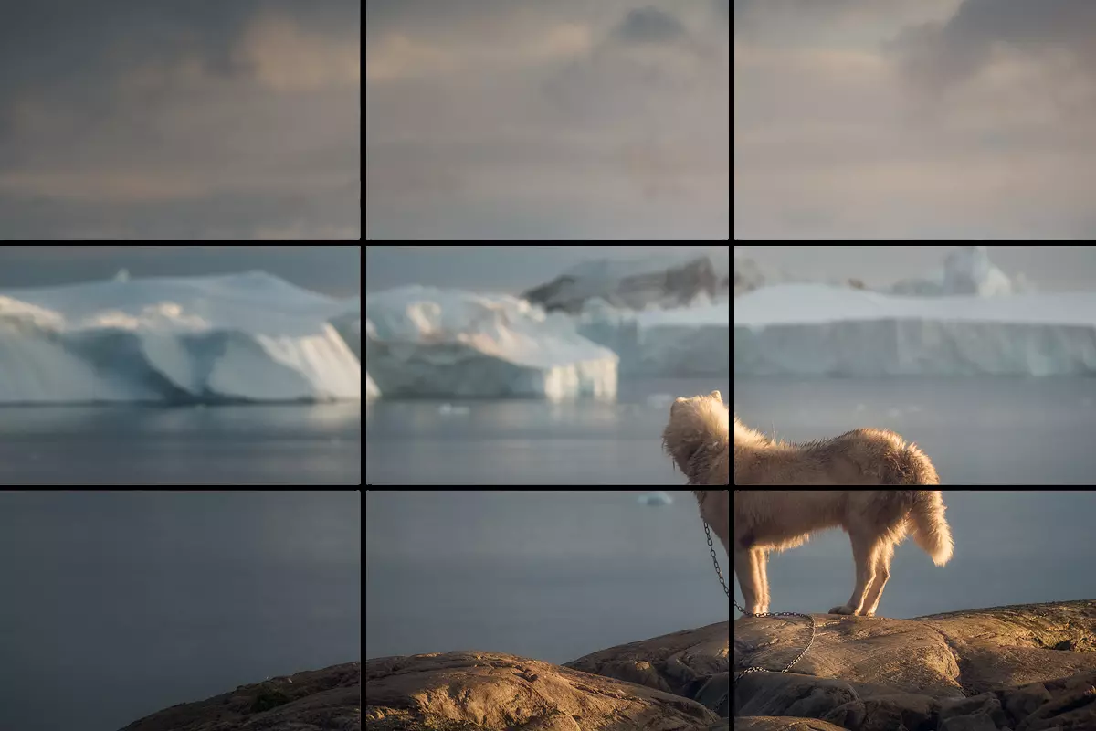
After you take the picture, you can head over into your Photos app and start playing with different settings. First thing I would do is crop the picture to the primary subject matter. Samsung and Apple on current models both give you the Rule of Thirds* grid to help you position your subject in the picture.
Next thing would be to play with a few settings. You can use the Magic Wand Adjust setting to see what outcome you get, but importantly you’ll want to look at:
- Exposure
- Contrast
- Black Point
- Saturation
- Vignette
Little changes to reduce exposure, increase contrast, increase black point, decrease saturation slightly and vignette to match your backdrop will help to create a nice visually appealing outcome. Each picture will be slightly different, especially depending on how much the colours and lighting vary, but once you find a combination that works best for your space you should be able to copy and paste that edit combination to your heart’s content.
Common Problems
Let’s take a look at how some photos might come out that you’re not quite happy with, and how we can improve the outcomes in each case.

The things that jump out about this picture primarily are that the black is not black enough and the colours are washed out.
The most direct way to fix this issue is to first reduce the exposure when taking the picture, and then potentially also adjusting it afterwards. This can also come from lighting that is too strong and direct, so if you can’t fix it from the camera you can fix it by putting a piece of baking paper or light fabric over your light when taking pictures (while making sure things don’t overheat and cause fires). But this will diffuse the light and reduce the intensity of the lighting.
The things that jump out about this picture primarily are that the white is too dark and the colours are too close to black.
The most direct way to fix this issue is to first increase the exposure when taking the picture, and again potentially also adjusting it afterwards. This can also come from lighting that is too weak, so if you can’t fix it from the camera you can fix it by bringing the light source closer to the subject or by finding a stronger light source. If you don’t have an adequate light you can also use sunlight on a nice day, you just might need to position the model correctly to catch the sunlight without casting shadows.
This one is pretty good, but the bigest problem is that the cast shadows are very strong especially in the eyes and face (a spot we generally want to highlight on our models, right?!).
The most straightforward fix to this is to reposition one or more of your lights to get more direct lighting towards the face, and even pointing the light upwards from below the face to underlight those shadows. Just being cautious not to over saturate the lighting.
This is another one that is almost there. The biggest problem this photo has is it has been a bit over-edited in post.
You can get a very artsy outcome by pushing a lot of different settings around, but by overdoing the settings you end up with an outcome that is not representative of the model and even a bit cartoony.
This might be more of a preference thing and I’m sensitive to it as I was guilty of this for a long while, but it’s not the most ideal.
This is an outcome that I feel very happy with. It is lit well, the colours represent the real model very closely, there’s some shadow without too much contrast or comical aspect.
Is the paintjob perfect? No, but art never is right?
The important thing is that this is a great representation of the real thing.
Maybe at some point I’ll post all of these models on social media and see which people enjoy the most.
Great Mini Picture, Great Many Likes
I hope this has been a helpful crash course in miniature photography. There’s so much to it that we could keep going into, but hopefully this article is useful for a hobbyist who just wants to get some pictures up of their miniatures that look representative of the real thing. Feel free to send along any questions you might have, and hope to see your painted models out in the wilds of social media!
*Rule of Thirds: The Rule of Thirds is a compositional guideline where an image is figuratively divided into nine equal parts using two horizontal and two vertical lines, and important elements are placed along these lines or their intersections to create a more balanced and visually engaging composition:

If you’d like to help us continue our work, we’d love to have your support. All Patreon Tiers include Discord access, exclusive articles and regular contests. Our Tiers are priced to be within everyone’s reach, so please click here to join us today!


2 thoughts on “The Miniature Painter’s Guide to Photography”