

Article by Peter Atkinson
If I could say it in words, there would be no reason to paint
~ Edward Hopper
The votes are in! About 2,000 of them in fact, so thanks for the fantastic response. Welcome to Round Two of our contest to find the greatest work of art in the Warhammer fantasy canon1; if you missed the original article, you can catch it right here:
A note on crediting artists
GW is notoriously patchy on crediting artists, especially in the modern era. We’ve made a sincere effort to credit artists as far as possible, and you’ll see we’ve included a lot of hyperlinks to their own websites or online galleries. But we couldn’t find full details for a couple of them, so if you’re able to identify any that we’ve missed, please do let us know and we’ll be glad to update the article.
Now with 8/16 of your nominations eliminated, we move on to the quarter finals:

But we need to talk about something first.
Karl Kopinski’s Sad News
Since the original article was published, the great fantasy artist Karl Kopinski has shared the news of his ill health on his own social media:
Karl’s work is legendary and extends well beyond the world of Warhammer Fantasy into Magic the Gathering, 40K and portrait art.

The whole Plastic Craic team wishes Karl the best possible recovery. Karl has set up a GoFundMe to support his rehabilitation which we have made a contribution to, and if you’re in a position to do the same, you can do so at the link below:
Wishing nothing but the best to Karl and his family.
A Few Takeaways
Karl is represented in this competition through the classic Breton Bowmen, and keen-eyed observers will notice that we paired up old vs new art as far as possible, within the constraint that we didn’t get a precise 50:50 split in nominations. 7 of the 8 Round One contests were Old vs New, and that ended in a 4-3 split in favour of Old – literally as close as you could get. Our final contest was New vs New so there are actually four of each in the quarter finals – it’s great to see the classics being honoured, and just as good to see newer art being elevated too.
In the voting itself, there were a couple of ass-kickings and a lot of nail-biters. You’ll notice that I rounded off the results in the bracket above to the nearest whole number, but I actually couldn’t do that for the 6th contest (Blanche’s Moonclan Grots vs Nagash and Morghast), because to the nearest whole number that ended up 50-50. There was one single vote separating them, ending just 126-127 in favour of the latter!
King John had three nominations with Mordheim Illustration progressing. Along with Geoff Taylor having two works in the Final 8 (The Vision of Mordheim plus White Dwarf 250) as well as one from Karl Kopinski (Breton Bowmen), the big dogs of WHFB art have fully half the field covered between them.
Lastly, we do have two artworks whose artist we are still unable to identify, which we’ve labelled as Nagash and Morghast and Cities of Sigmar. These are great works of fantasy art and deserve recognition, so if you’re able to point us in the right direction, we’d love to give credit to both.
Now, shall we get into the next round of voting?
Cities of Sigmar (Artist Unknown) vs The Vision of Mordheim (Geoff Taylor)
Cities of Sigmar

Nominated by Will: “I like this one because it shows the contrast between the high fantasy elements of the setting and the regular people existing in it”.
What we said: Spot on. This piece exemplifies a really important subgenre in AOS art that illustrates everyday life away from the field of battle, with ordinary people in extraordinary circumstances. Here we see humanity, battered but unbroken.
The Vision of Mordheim

Nominated by Dr Internet: “The beautiful chaos that is Geoff Taylor’s cover of White Dwarf issue 238. Also known as the cover for MORDHEIM BABYYYY”.
What we said: “Beautiful chaos” is about right – this piece rewards exploration, because there’s loads going on. The cage hanging from the gallows pole still comes up in model kits today – from the Loonshrine to Swampboss Skumdrekk – and check out that little fella down at the front right, staring right back at you. Not easily forgotten.
Mordheim Illustration (John Blanche) vs White Dwarf 250 (Geoff Taylor)
Mordheim Illustration
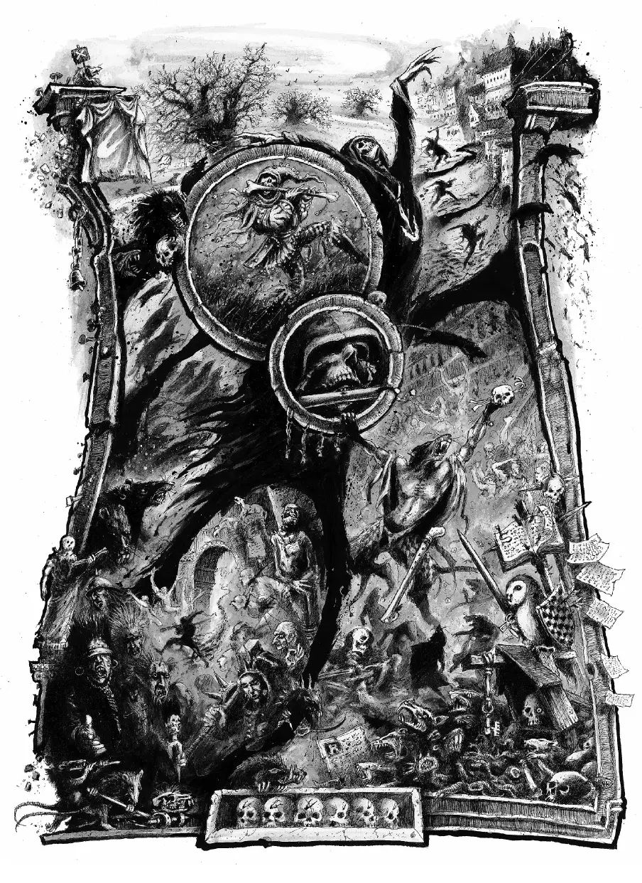
Nominated by AussieWargamer: “I adore every single illustration in the Mordheim rulebook. So hard to pick a favourite, so I’m kind of cheating with this full-page illustration including such Mordheim absurdities like the owl knight, the bone flute and whoever that dude is running through the arch. John Blanche insanity.”
What we said: Took me a while to spot the owl knight, but there he is! Those weird vulture creatures with human heads (towards the centre of the drawing) are peak Blanche.
White Dwarf 250

Nominated by Graal: “The new WHFB box when I first started playing, and also the cover art of the first White Dwarf issue I ever had! While I don’t own any Destruction armies now, Orcs & Goblins was my first army back then ”
What we said: That first WHFB starter box always holds a special place in our memories – hopefully the young ins coming up now will have the same love for Dominion and Skaventide2. For me it was Cardboard Grom the Paunch, and for Hakan it was this classic artwork by Geoff Taylor.
Big Monster Thingy (Paul Dainton) vs Nagash and Morghast (Artist Unknown)
Big Monster Thingy3
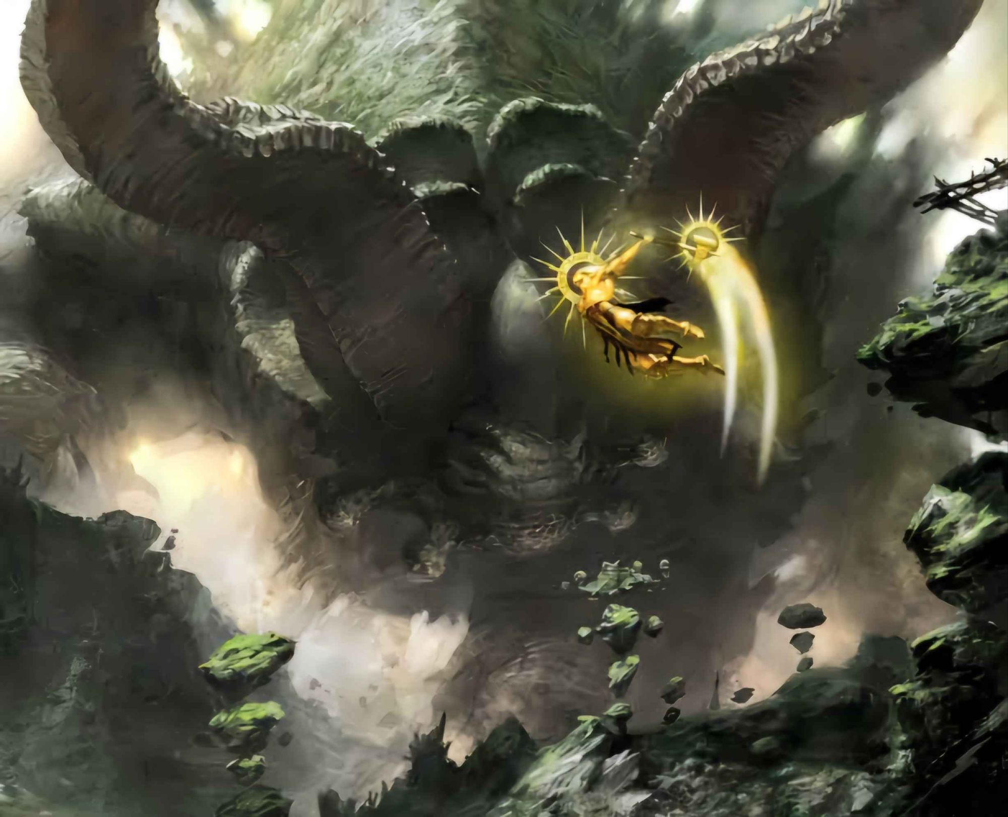
Nominated by Tropichammerz: “This piece of art from the AOS1 Core Book was when I really began appreciating how epic the scale of this new game was: we’ve got Gods fighting huge continent-sized monsters. As a big Fantasy player back in the day, this was the artwork that won me over to the setting.”
What we said: Ah, this takes me back to playing Shadow of the Colossus. I kind of want to play this out as a custom scenario, or maybe some kind of roll and write game, but I would need it it to be punishingly difficult. As a side-note, how cool are those floating rock columns? Artist Paul Dainton using those small details to tell us that we’re somewhere very different now.
Nagash and Morghast

Nominated by Michael Thomson. Umm…what’s happening to those people being herded forwards? I’m gonna say “nothing good”. A dramatic reminder that Nagash is an unknowable eldritch God, and the representation we see on the tabletop (as cool as it is) is merely an avatar.
Breton Bowmen (Karl Kopinski) vs Blood Bowl Cover Art (Filipe Pagliuso)
Breton Bowmen
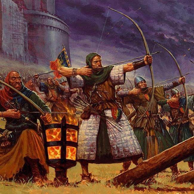
Nominated by Nic Wright: “I’m shouting out who I consider to be the literal GOAT of Warhammer art – Karl Kopinski. For me he is the father of immersion in the world of Warhammer. He was grim before it was dark.
Kopinski had that iconic that sketchbook style that enables his work to pull you into a setting at the touch of a brush. An unbelievable artist who formed the backbone of much of the most-publicized and timeless art from Fantasy AND 40k. I can’t think of another artist of this ilk who has had so many miniatures created from direct replicas of his art as Karl.”
Blood Bowl Cover Art
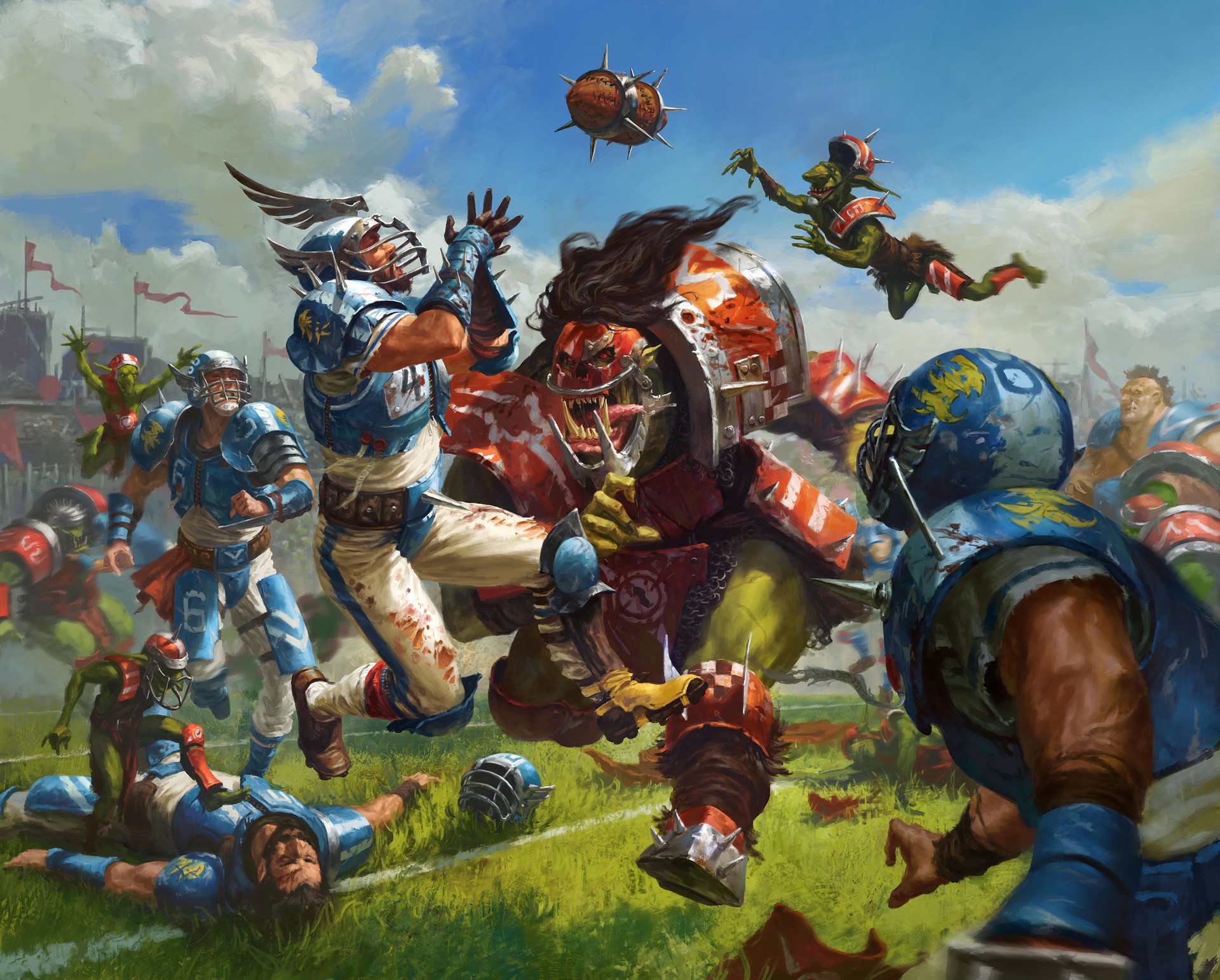
Nominated by Peter Atkinson. Let’s take a moment to celebrate the boxed games. I’m (just about) old enough to remember Man O’ War, but for me it’s the iconic cover art from the modern relaunch of Blood Bowl that takes the biscuit.
I love the kinetic energy of the various Grots – whether it’s sticking the boot in, or soaring optimistically for an attempted interception – but it’s the central collision that I love about this work. You just know that the next frame is a sickening impact, where the human guy takes the catch but gets absolutely nailed by that rampaging orc.
Can you imagine what it would be like playing NFL against orcs? That human catcher is really athletic, but he’s got no hope. Fucking BAM!
So that’s a wrap! Thanks for voting. We’ll leave this poll open for a week or so, then smash into the next round, where we’ll report the results and invite you to vote on the Top 4!
Until then – have a good weekend, nerds. See you on the other side.

If you’d like to help us continue our work, we’d love to have your support. All Patreon Tiers include Discord access, exclusive articles and regular contests. Our Tiers are priced to be within everyone’s reach, so please click here to join us today!


3 thoughts on “The Greatest Warhammer Fantasy Art: Top Eight”