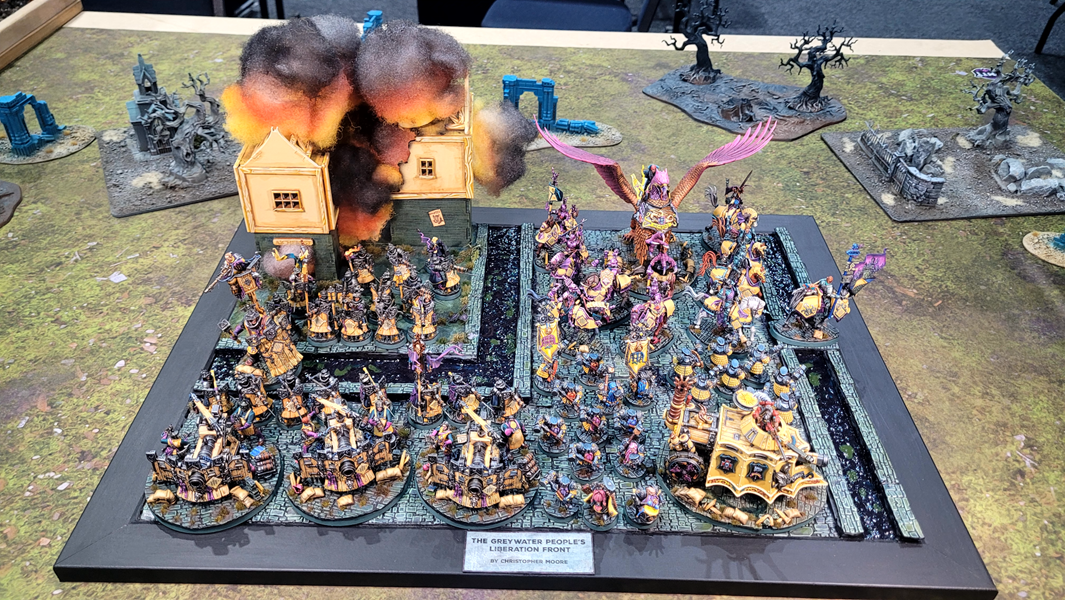
Call to Glory at CanCon 2026 is in the books, but the celebration of hobby continues! I was keen to sit down and have a chat with Christopher Moore, who won both Best Painted and Best Presented (player-voted, formerly known as Coolest Army) at the 130+ player event. Christopher’s Cities of Sigmar army is a thing of beauty and I was able to pick his mind about the project and what he’s got going on in the future.
Hey Christopher, Congratulations on winning both Best Painted and Best Presented at Call to Glory 2026! How are you feeling now the dust has settled?
I’m feeling very inspired by the awards, I immediately dived into the next project for Call to Glory 2027. I was so nervous all weekend at CanCon, hoping to be in the running for Best Painted, but the Best Presented award was very unexpected! There are few things better in the hobby than putting an army on the table that people enjoy looking at. So I am focusing on that going forward. Painting well is one thing, but an army that resonates with others is the best motivation.
I agree completely – putting down an army that makes people go ‘wow’ is immensely satisfying. Talk me through the process of how this army came together. What was your inspiration? How did you land on the striking colour scheme?
My interest in human factions goes back to early Warhammer Fantasy days, and I enjoy pitting them against hordes of Orcs and Goblins. I had a big 20-year break from the hobby and came back to painting during the COVID lockdowns. I have a few armies that I’m happy with, but I tend to paint in really bright magentas and fluorescent greens. My previous armies (my Fyresladies – who are my female Fyreslayers – and my Gitz) are all very bright, with really high-impact colours, so I wanted to work on something more warm and grounded. I picked yellow, which is my wife’s favourite colour.
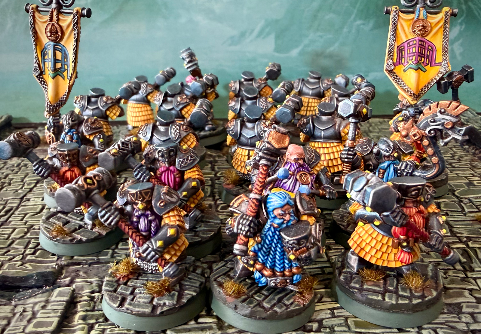
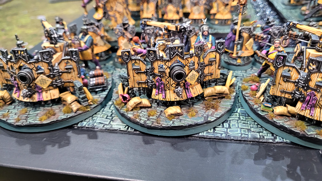
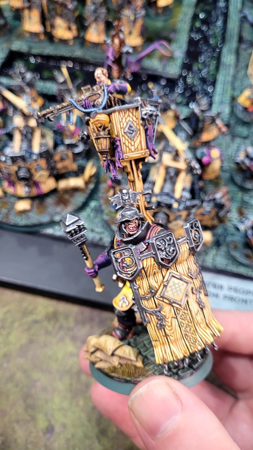
So I was looking for the right army when the new Cities of Sigmar models were launched. When I saw the shields on the City of Sigmar Fusiliers and the wooden panelling on the front of the cannons, I knew that was going to be my next army project. I liked the lore of Greywater Fastness, with the focus on the gunline. The narrative tension between industry and the constant reclamation under Alarielle’s influence in Ghyran shaped my thinking, with cobblestone bases and the subtle presence of organic materials like soil, moss, puddles, and tiny plants. The Duardin Hammerers were my favourite to paint, and they will eventually become my Steelhelms. Then the Gotrek novel, Skavenslayer, set in Greywater Fastness, came out, which was great to listen to while painting (and I’m slowly collecting Skaven for a new project). My favourite colour, magenta, is a secondary colour. It took me a while to find the right tertiary complementary colour, and that’s how the TMM blue came about.
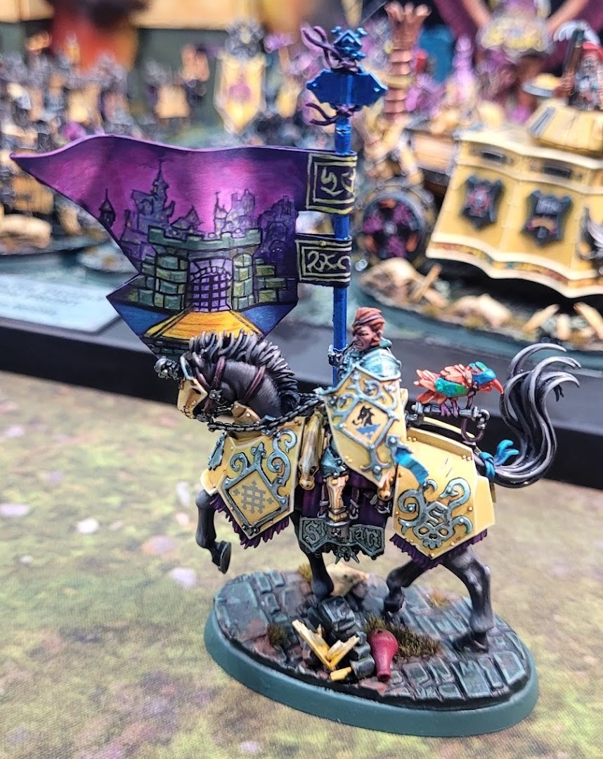
The colours all work really well together and the magenta provides the perfect pop without looking out of place. You told me that this army was your first real attempt at freehand. The banners look fabulous. What was the process like?
This was my first attempt at painting freehand banners. I had done one freehand piece previously, my Codewright, but that was very different to the approach for the big banner, which took about a week. I used AI image generators—Midjourney, ChatGPT, and Gemini—to create images of the scene I wanted. I learned this from another artist, a sketch artist who uses AI-generated reference images. The idea was a portcullis with a drawbridge, over a river, with a kind of fantasy town behind it. I created a whole bunch of images, then made pencil sketches based on that, because I need reference images to work from.
I think that, honestly, that’s the best way to use AI in the hobby. You know, we get lots of inspiration from the battletomes, White Dwarf, and Instagram, and obviously from Magic: The Gathering and other fantasy illustrations, but sometimes we need something more specific to help us move in the right direction. The banner shape was designed on paper and then put into Illustrator. Then I sketched the design by hand, scanned it, and put it into Photoshop to thicken the black outlines. Printed that on regular paper, and used Mod Podge to thicken the structure and create the wave. I painted over the sketch using acrylics in a watercolour style, inked the black lines in comic book style, and went back to work on the highlights.
Talk me through your woodgrain recipe – how did that come about?
The woodgrain recipe came about through a lot of trial and error. You can see different versions of it across the army, and there was a fair amount of experimentation before I settled on the final approach.
The recipe starts with a black primer, then a base coat of Mournfang Brown. From there, I begin layering with AK Light Rust, then Pro Acryl Warm Yellow. Then glazes of AK Golden Brown, followed by a very faint glaze of Skrag Brown, to create colour variation. Then borders and deep recesses are increased with Mournfang Brown and a little touch of black. With the glazes, don’t wash the area; use a patchy approach to create different colour combinations. That starts to create the rich, warm tones in the depths of the woodgrain, and it works as a foundation for the yellows to sit on. To get a really warm, golden, luscious yellow, you need to work over browns and light orange-browns.
From there, I move into Pro Acryl Bright Yellow Ochre for the first striping of the woodgrain pattern. Occasionally, I would use a very watered-down AK Clear Yellow to glaze over that to add some variation. Next, I come back in with AK Ice Yellow, pushing into the final highlighting and reducing the number of strokes. Then I get into the shaded areas and glaze back in with Skrag Brown. The final step is a highlight using Pro Acryl Bright Pale Yellow. The Cavaliers yellow is an entirely different set of colours and process!
Mate, so much work has gone into this project! What did you learn from it all?
Initially, I had planned to develop my non-metallic metals (NMM) for the Cities project. I love true metallics (TMM), and I have a fully metallic red Khorne army, but I thought I needed to improve my NMM. The initial experiments showed that NMM didn’t really work with the yellow. So I experimented with glazing on the metals and developed a green-tinted shading that connected to the theme of Greywater Fastness. The lesson was that TMM resonates with me more than NMM, and that you don’t have to do NMM to win Best Painted if you focus on developing other areas that showcase development and technique. I’ve also learned when thinking about a new project from scratch to plan it all out from the start. So my next project has a much more cohesive approach, and I’ve already dialled in the colours and the bases, and have a clear plan for the display board rather than trying to do that at the end.
Painting burnout hit me with the army when I was getting ready for Sydney GT in October. But I learned a lot from the feedback from the Painting Judge, Jaydon (warpfireminiatures on Instagram), about the story that needed to come across in the bases, so I worked on that, then it was ‘brushes down’ for about 10 weeks. I came back about two weeks before CanCon and painted the banners.
Nice. I’m all too familiar with painting burnout on big army projects, and how some good feedback can be just the motivation you need. The army is obviously beautiful, but how did it play on the tabletop? Are you planning on making any changes to the list?
The army did okay at Sydney GT because I still had the teleporting Pontifex and the Kharadron Overlords regiment of renown, Skyport Profiteers, with the Skyport ability, so I could still score battle tactics. But then the third round of nerfs and points hikes to the army was a big hit. I took it to a one-day tournament about two weeks before CanCon and lost all my games, where previously I had almost come first. I didn’t even have the cannons ready for the table when they were at their best! It takes far too long to paint new units.
So I knew going in that Call to Glory 2026 wouldn’t be a competitive event for me. But that actually made the event really enjoyable, because I knew that something would have to go very lucky for me, or my opponent would have to be very unlucky, which did happen once. My opponent just got unlucky, and I got some nice rolls on my charges, so I got one victory. But I had five tremendous games. They were all close except for one—thank you, Christian Bugg (haha!)—but the other four were all super close games. I found that not worrying too much about being competitive with the army let me just enjoy the games. I really enjoy getting the army on the table, playing, and just having fun.
Do you have lore and background for your army and characters?
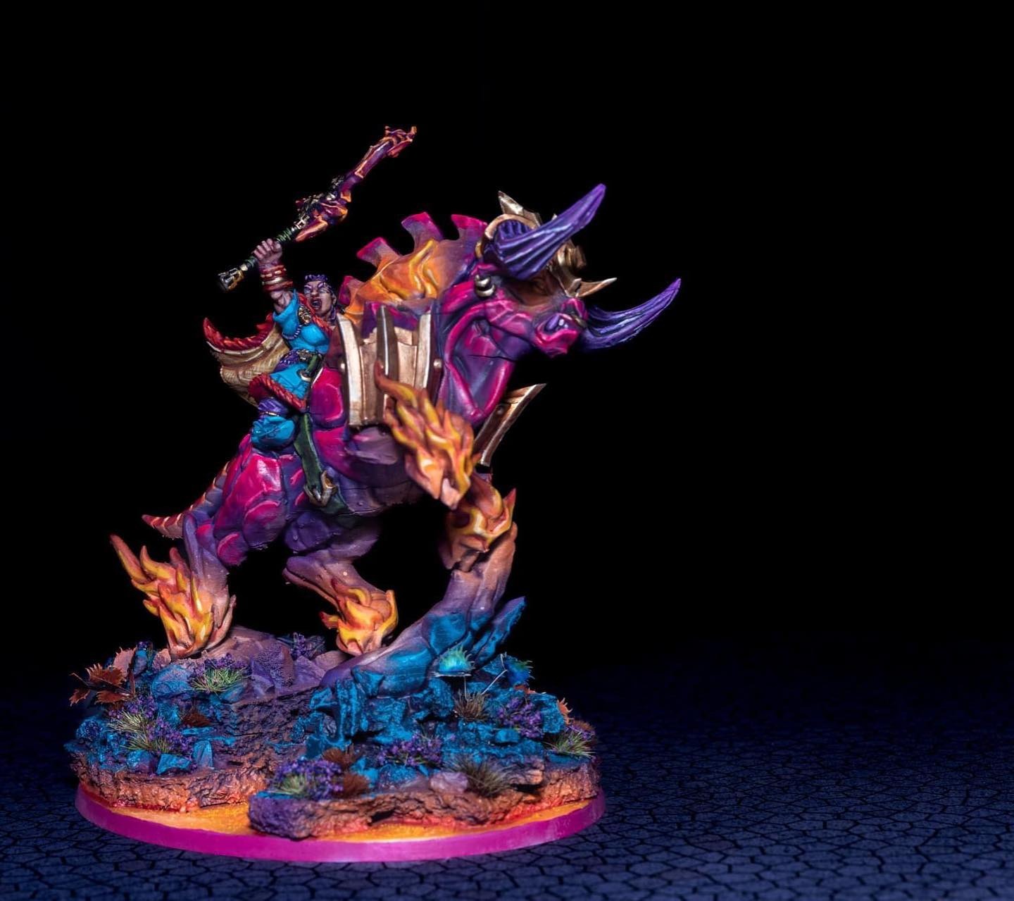
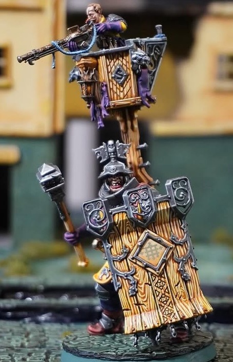
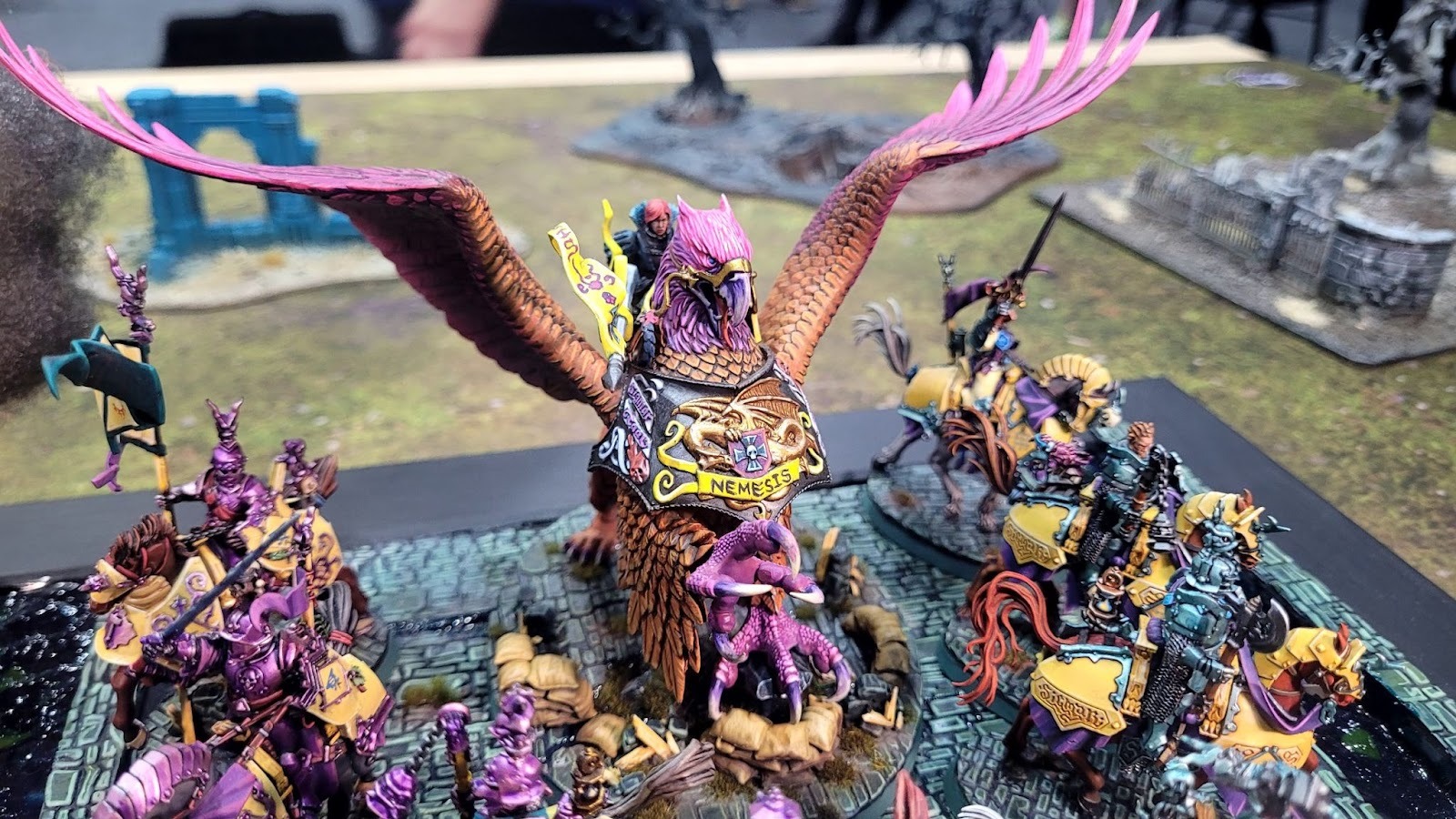
All of the characters and units are named, and the inspirations behind them are a real eclectic mix of references. My Freeguild Marshal on Griffin is Lady Ketricken, named after my wife’s D&D character. The name itself comes from Robin Hobb’s Farseer books. She rides a griffin called Nemesis, and there is a little bit of kitbashing on the model. There is also a thread running through some of the naming that connects to the wood theme and to my love of Australian flora: one of my Ironweld Great Cannons is called Ghost Gum, and one of the Fusilier units is called the Paperbarks.
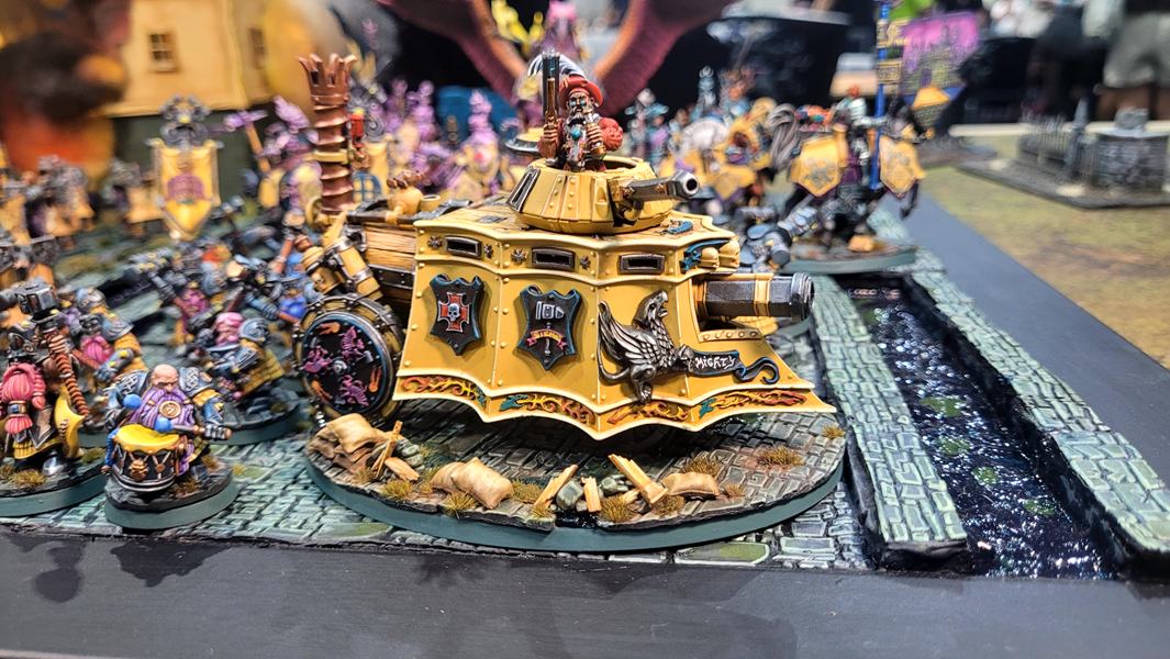
And then there is Mighty Molly, my steam tank, which is probably my favourite model in the whole army. Molly is the only yellow female engine in Thomas & Friends, so the name felt right.
Love that. I find a little bit of background to an army goes a long way to ensure your theme is consistent. What’s next after this project? What have you got on your hobby desk at the moment?
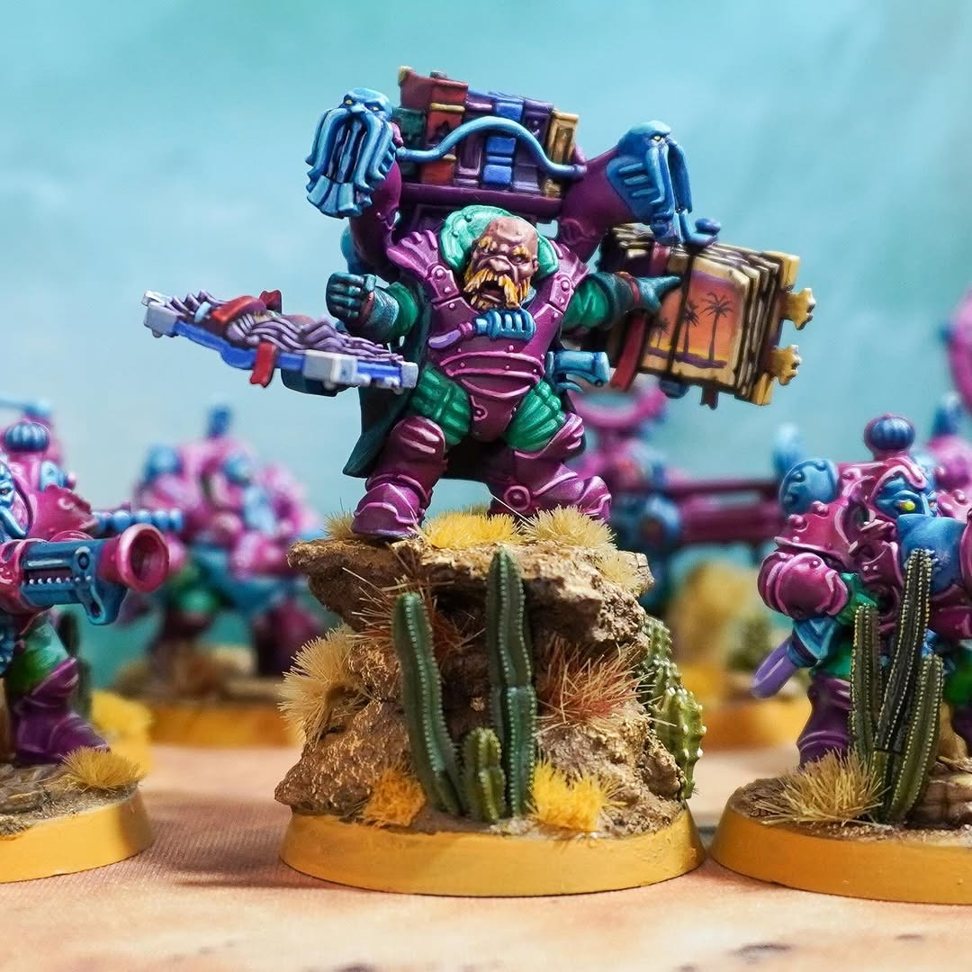
The awards have inspired me to tackle something more ambitious, and I want to expand into a full Kharadron Overlords army. The concept has a synthwave element, but more specifically draws on Outrun, an offshoot of synthwave. The army will have a desert sunset theme, with a coastal element for the palm trees, and I would like to play with forced perspective on the display board, but it is a super ambitious plan, so we will see how it comes together.
I can’t wait to see it! Thanks for your time Christopher, and congratulations again on your wins! You can find chris over on Instagram if you want to see more of his work.

If you’d like to help us continue our work, we’d love to have your support. All Patreon Tiers include Discord access, exclusive articles and regular contests. Our Tiers are priced to be within everyone’s reach, so please click here to join us today!